PROJECT / Brand, packaging & campaign
Mardo Lino
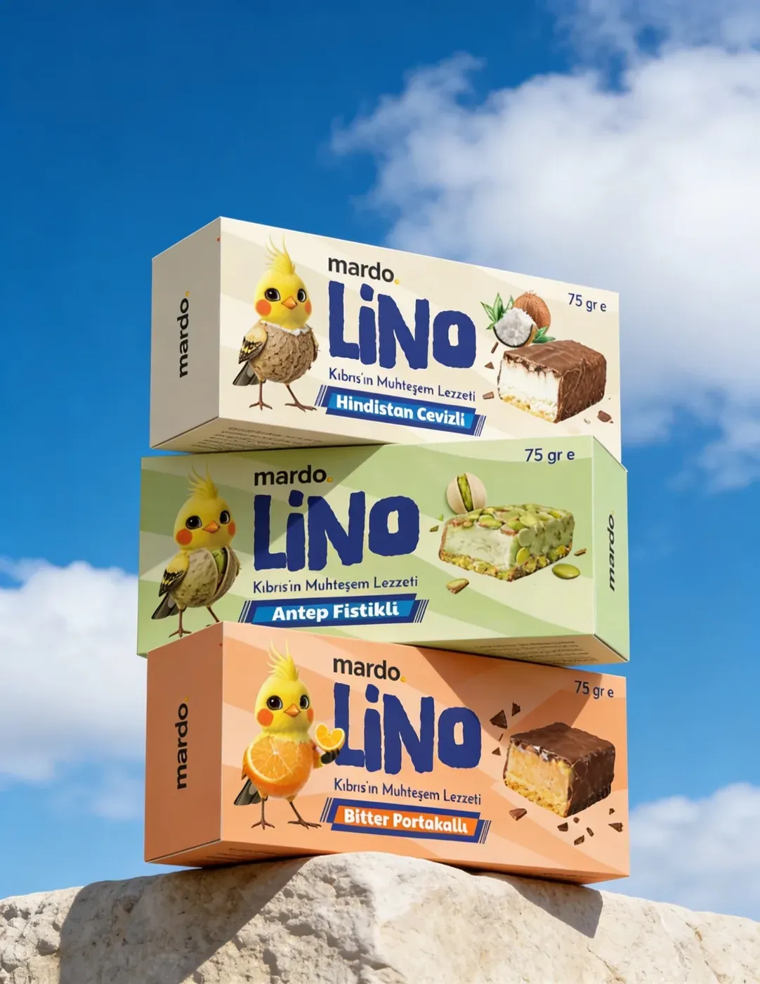
From Lino’s character to a family of packaging, different flavours share one recognisable brand world.
The need
Help the flavours stand apart on a shelf while remaining recognisable as the same Lino product family.
The design decisions
A shared wordmark and bird character connect the family. Ingredient-specific colours and character treatments distinguish the flavours, with the same elements carried into campaign imagery.
The output
The Turkish project gallery presents eight images covering the packaging family, coconut and pistachio character treatments, final packaging layouts and campaign applications.
Explore all eight artwork images in the project gallery (Turkish)